Amazon Storefront Design for Skincare Brands (2026)
Amazon storefront design for skincare brands in 2026: which modules convert, what to skip, and the layout Booscala recommends for routine-based skincare lines.
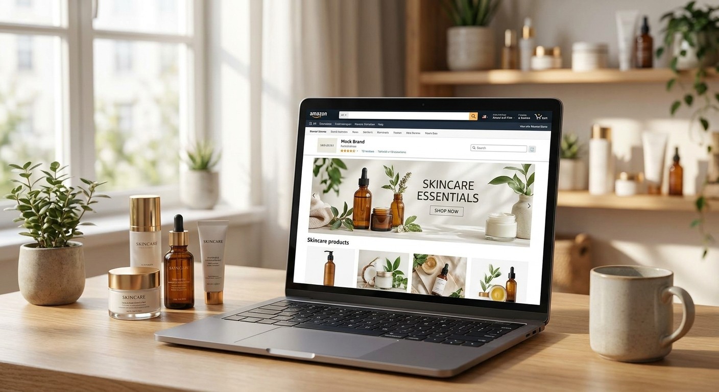
Amazon storefront design for skincare brands is not a mini-website exercise - it's a routine-sequencing tool, and most prestige and K-beauty skincare lines still build it like a static brochure instead of a shopper's decision path.
TL;DR
Amazon storefront design for skincare brands wins when tiles map to skin concerns, not product categories alone - buy that layout.
Routine Builder modules that sequence cleanser to serum to SPF outperform static grid tiles for session depth.
Skip generic templated storefronts with zero ingredient callouts - shoppers bounce fast in 2026's crowded skincare search results.
Anti-aging A+ content and storefront tiles need shared ingredient language, not competing claims.
Why this matters
A skincare storefront on Booscala client accounts gets treated as a second listing, not a homepage add-on, because skincare shoppers rarely buy one SKU and leave. They buy a cleanser, come back for the serum, and return again for SPF three weeks later. A storefront that doesn't route them through that sequence loses the second and third purchase to a competitor's tile.
2026 skincare search results are more crowded than 2024 or 2025 - more K-beauty entrants, more private-label competitors, more brands running near-identical A+ content. The storefront is the one asset a competitor can't copy tile-for-tile without it looking like theft. Get it wrong and you're paying for traffic that lands on a page indistinguishable from three others in the same search.
Who this is for
This is for skincare brand owners and marketing leads managing an existing Amazon presence - anti-aging, clean beauty, K-beauty, or multi-step routine lines - who already have a storefront live but suspect it isn't pulling its weight on session depth or repeat-tile clicks. If you're pre-launch and still deciding on SKU count, this framework still applies, but build the routine logic before the storefront, not after.
What to look for in a skincare storefront
Routine sequencing logic
Skincare is rarely a single-SKU purchase. A storefront that groups by cleanser, serum, moisturizer, and SPF instead of bestsellers and new arrivals gives the shopper the next step in their routine without a second search. This single change moves storefronts from a browsing dead-end to a cross-sell engine.
Skin-concern navigation
Anti-aging, acne, hyperpigmentation, and sensitive-skin shoppers are searching with different intent even inside the same brand catalog. A tile structure organized by concern - not just by product type - cuts the taps needed to find the right SKU, and fewer taps means fewer abandoned sessions.
Ingredient transparency
2026 skincare shoppers read ingredient lists before they read bullet points. Storefront modules that surface hero ingredients like niacinamide, retinol, and centella up front build the same trust a listing's A+ content is supposed to build - duplicate that language, don't contradict it.
Mobile tile hierarchy
Most skincare storefront traffic loads on a phone screen first. A storefront built around a desktop hero banner and small mobile thumbnails wastes the highest-traffic device. Keep the top three tiles decision-critical - routine builder, bestseller, and concern navigation - before anything decorative.
Compliance-safe claims
Skincare claims sit under tighter scrutiny than most beauty categories in 2026, especially anti-aging and clinically-proven language. A storefront module repeating an unapproved claim from a listing risks a takedown on both assets at once, not just one.
Get your storefront audited
See which modules are costing you sessions before your next launch.
Top picks: storefront modules that actually convert
The workhorse pick: Routine Builder tile
This module sequences three to five SKUs into a step-by-step routine grid instead of a flat product list. Brands managing multi-step lines see the clearest lift here because it answers the shopper's next question before they leave the page. Pair it with the cosmetics storefront benchmarks most beauty catalogs already run against. Buy.
The trust builder: anti-aging ingredient module
A dedicated module explaining retinol percentage, peptide complex, or barrier-repair actives mirrors what should already live in your anti-aging A+ content modules. Repeating that language on the storefront reinforces the claim instead of introducing a new one. Buy for any brand with an active-ingredient story worth telling.
The scroll-stopper: ingredient close-up carousel
Macro shots of texture, swatch, or ingredient close-ups pull scroll-through on mobile better than lifestyle photography alone. This only works if your product images are already built for what the algorithm reads in skincare images - reused stock lifestyle shots undercut the module. Consider if your image library supports it; Skip if it means shooting from scratch mid-quarter.
The wildcard: video demo tile
A 15-30 second application demo tile works for texture-heavy products like masks, exfoliants, and oils where shoppers need to see how the product behaves, not just how the jar looks. It's a heavier production lift than a static tile. Consider for hero SKUs only, not the full catalog.
The one to skip: generic review carousel
A storefront module that just repeats star ratings shoppers already see on the listing adds nothing new to the page. It eats a tile slot that could carry routine or concern navigation instead. Skip.
What to avoid
Templated storefronts with no concern navigation. They look finished but route every shopper through the same generic path regardless of what they searched for.
Overloaded tile counts. Past six to eight modules, load time and scroll fatigue outweigh the extra real estate - trim before you add.
Claims mismatch between storefront and listing. If the A+ content says dermatologist-tested and the storefront module doesn't, or the reverse, it reads as inconsistent even when both are technically compliant.
Verdict comparison
Routine Builder tile
Best for: Multi-step lines
Mobile priority: High
Verdict: Buy
Anti-aging ingredient module
Best for: Active-ingredient stories
Mobile priority: High
Verdict: Buy
Ingredient close-up carousel
Best for: Texture-driven SKUs
Mobile priority: Medium
Verdict: Consider
Video demo tile
Best for: Hero SKUs only
Mobile priority: Medium
Verdict: Consider
Generic review carousel
Best for: Nothing new
Mobile priority: Low
Verdict: Skip
FAQ
What's the best Amazon storefront design for skincare brands in 2026?
A concern-based navigation structure paired with a Routine Builder module wins in 2026 because it routes shoppers through a multi-step purchase path instead of a flat product grid. Static category tiles alone underperform for lines with three or more sequential SKUs.
How many tiles should a skincare storefront have?
Six to eight tiles is the practical ceiling before load time and scroll fatigue start costing sessions. Prioritize routine sequencing, concern navigation, and bestseller tiles above anything decorative.
Is a video demo tile worth it for skincare?
It's worth it for texture-heavy hero SKUs like masks or exfoliants where shoppers need to see product behavior, not for the full catalog. Treat it as a Consider, not a default build.
Should storefront modules repeat A+ content claims?
Yes - storefront modules and A+ content should use identical ingredient and claim language. A mismatch between the two reads as inconsistent even when both pass compliance individually.
Does storefront design affect Amazon search ranking for skincare?
Storefront design doesn't directly feed the ranking algorithm, but the session depth and dwell time it drives are signals tied to conversion, which does influence organic rank over time.
How often should a skincare storefront be updated?
Update it every time a new SKU launches or a seasonal push like Prime Day or Black Friday changes which products should lead. A storefront that hasn't changed in over a year is usually promoting last year's bestseller.
What's the biggest storefront mistake skincare brands make?
Organizing by product type instead of skin concern is the most common mistake, because it forces the shopper to already know your SKU names instead of matching their problem to a solution.
Do clean beauty and K-beauty skincare brands need different storefront layouts?
The module types stay the same, but ingredient-transparency tiles carry more weight for clean beauty, while K-beauty lines lean harder on routine sequencing since multi-step regimens are the category norm.
One last thing
Most skincare storefronts fail on the third tile, not the first - shoppers land, scan the hero, then hit a category grid with no next step and leave. Fix the third tile before you touch the hero banner. It's the cheapest change on this list and the one most brands skip.
